Mapei Football Center - The Design
Architectural design guidelines by Onsitestudio.
Architectural design guidelines by Onsitestudio.
After already owning its own stadium, the Mapei Stadium, since the 10th of June Sassuolo Calcio now has a new home: the Mapei Football Center. “A structure of excellence in the field of sports facilities”, declared Giorgio Squinzi, CEO of the Mapei Group, “And further support for the first team and youth teams, as well as a place where fans and the local communities can meet, thanks to the numerous initiatives and projects that Sassuolo Calcio is planning to organise to encourage even more integration”.
Thanks to the club’s synergy with Mapei, in just a short space of time Sassuolo Calcio has managed to build a new facility with 6 pitches, one of which has a covered spectator stand, so that the first team and teams from the youth sector can train together. There is also a building where the center’s main offices are based and two smaller service buildings.
TRADITION AND INNOVATION WITH AN EYE ON THE LANDSCAPE
The center was designed by the Onsitestudio Design Studio, in partnership with Studio Giorgetta Architetti Paesaggisti. The premise for the facility was that it should maintain a relationship with the surrounding flat, open farmland, with the building becoming a part of the landscape looking out towards the open fields and the new pitches, as if it were a main gate opening onto a system of centuriation.
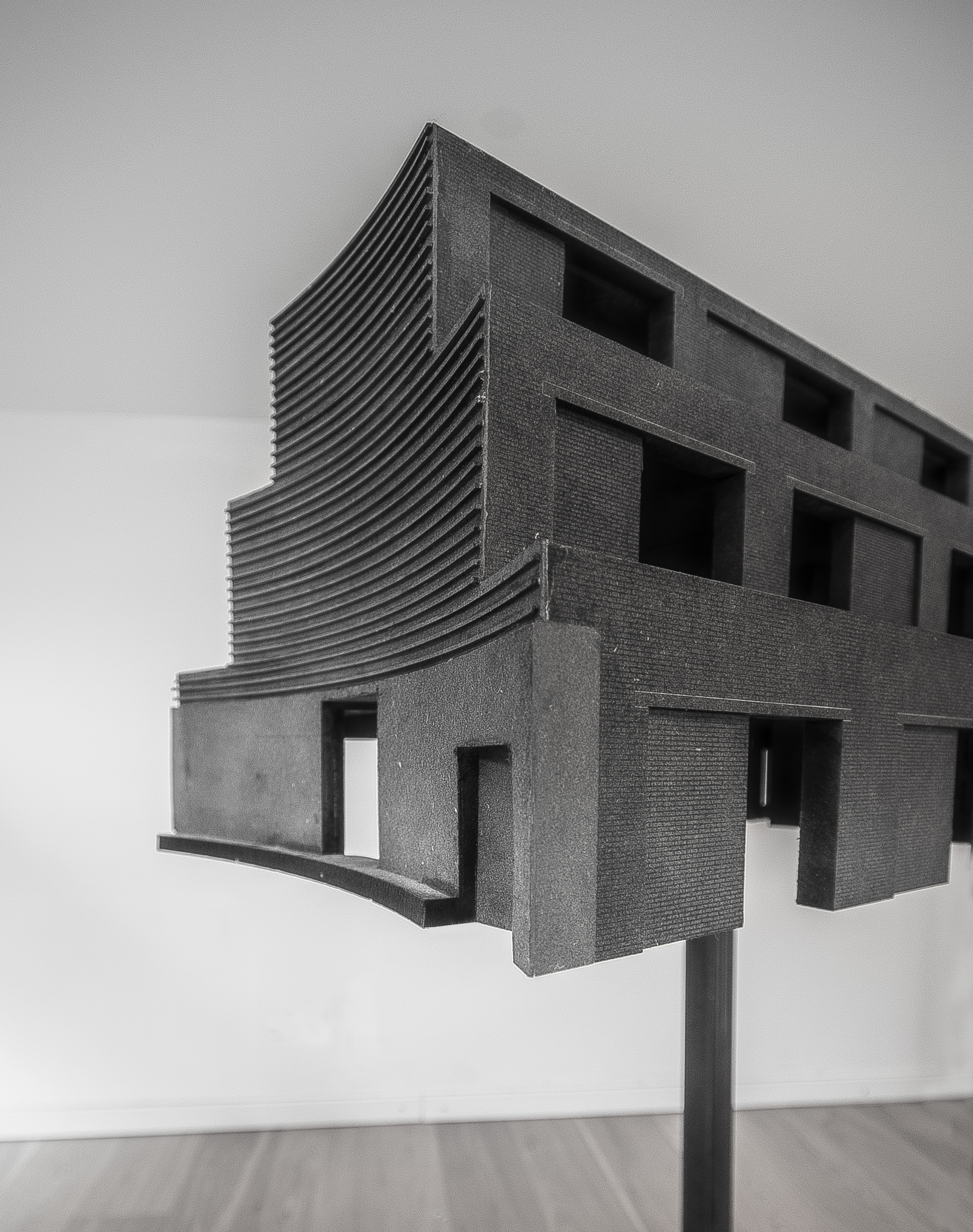
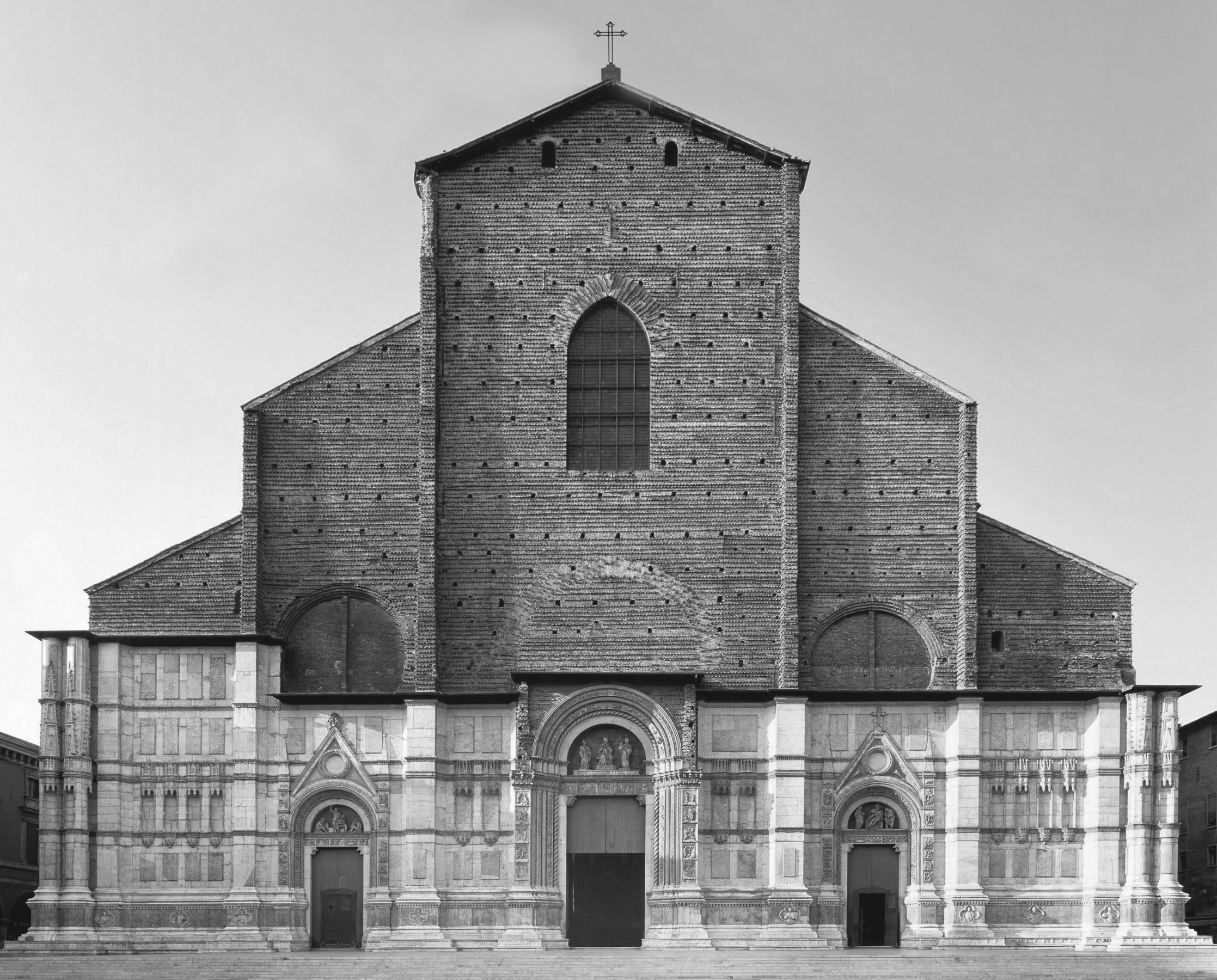
The design for the building, which takes inspiration from the forms and architectural features of the past (such as colonnades, porticoes, recesses, the use of symmetry, its bricks and proportions and details of the façades) is an attempt to view the present as an integral part of tradition and a collective quest.
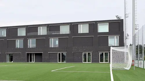
The typological reference is to the in-line elements, based on the repetition of brick structures of the great agricultural service architectures, such as the so-called “barchesse” or the ancient ceramics factories of this area, or to the sports buildings of Greek and Roman antiquity, that were arranged longitudinally on the edge of the fields.
CONSUME AS LITTLE SOIL AS POSSIBLE
The building is similar in size to the pitches, creating a calming effect, and is visible from a great distance, a landmark that is easy to recognise as if it were part of the landscape, giving a sense of continuity to the historical memories of the horizontal farming system, and giving it a new sense. The controlled scale of the building (around 12 m high) helps it become part of the landscape so that it provides a discreet backdrop to the trees, while leaving an open view towards the Modena Canal and the distant horizon. The building seems to echo an image by the photographer Luigi Ghirri (Cittanova, 1984) for its expression of the ambiguous and particular monumentality of the façades of isolated civil and religious buildings positioned along the horizontal landscape of Via Emilia in Central Italy. The north façade is the main one and is where the entrance has been positioned. It is curvilinear, so that it can receive sunlight from both the east and west, and is also concave, to welcome the flows of people arriving from both the sides and from the front. A bench running along the curve of the façade defines a small piazza featuring a large oak tree.
SOBRIETY IN THE CHOICE OF MATERIALS
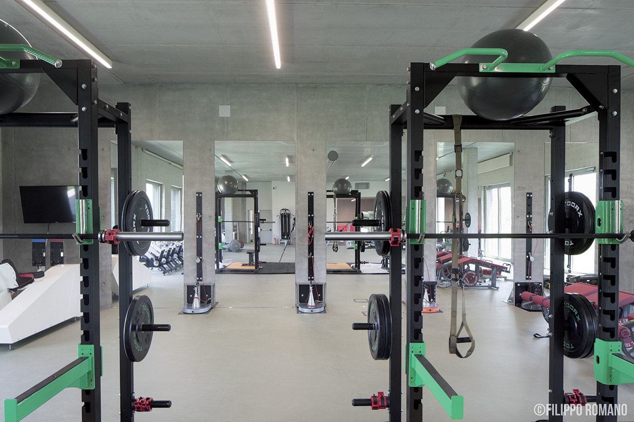
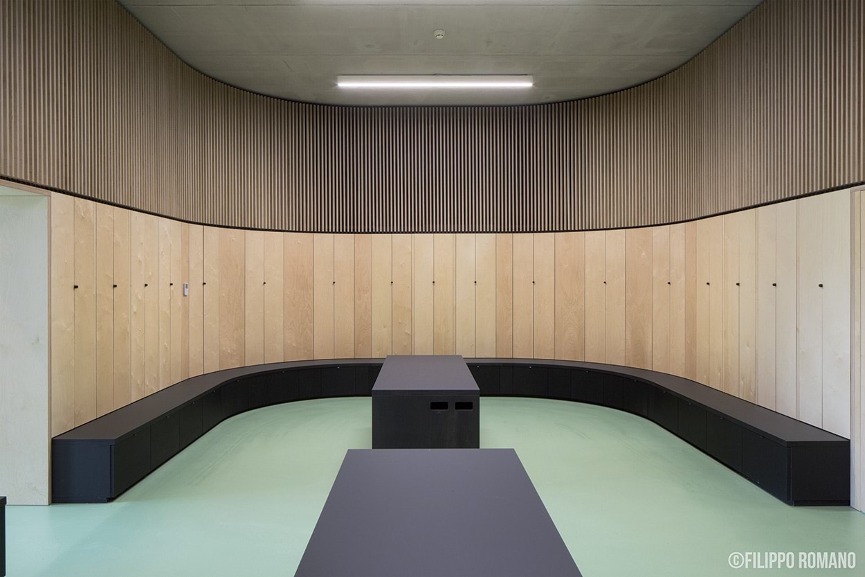
The design of the inside of the building, featuring a mix of materials that require no further finishing treatments, represents the tone and the sober yet articulated atmosphere, spartan but at the same time sophisticated, of spaces like those required by these types of facilities.
The horizontal and vertical reinforced concrete structures have an exposed finish, just like the finish of the precast, prestressed concrete floor slabs.
The openings along the inside of the perimeter walls and the main corridors are made from blocks of white cellular concrete with two types of finish: rough or exposed with a polished finish to ensure the durability of cleaning operations and to eliminate maintenance work in spaces that are used frequently and are often crowded.
The floors in the distribution spaces, changing rooms, and physiotherapy rooms are in coloured resin, while rubber has been used for the floors in the gymnasiums. The office areas have wooden floorings and the service areas and technical rooms have ceramic floors.
The walls in the service areas are covered with fine ceramic tiles up to a height of 2 m, while the remaining areas have been painted, apart from the distribution areas and the walls bordering with the outside, which are made from concrete blocks with an exposed finish.
Giancarlo Floridi and Angelo Lunati.
Onsitestudio


